


Each year, a brave panel of publishing professionals and design geeks dares to defy the idiom and judge a book by its cover. Held last night at Nobody Writes to the Colonel, the Canadian Publishing Professionals’ Association’s annual Covers Panel convened eight individuals from the offices of Random House, HarperCollins, Kobo, and Quill & Quire, asking them to single out the best and worst covers of the year.
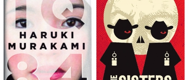
Fiction, short fiction, non-fiction, genre fiction–all were fair game, as were different editions of the same book (such as hardcover versus paperback). The panelists had no qualms about disagreeing; the layered cover of Haruki Murakami’s 1Q84 provoked divided reactions, as did the graphic image and distressed font of Canadian bestseller The Sister Brothers. Commentary ranged from typography to colour saturation to title placement, while jokes about kerning and serifs were met with laughter from the knowing audience.
While it initially felt strange to spend a whole evening dissecting the exterior of books, the discussion demonstrated just how critical shelf appeal is to their success. By revealing the effects of a misaligned blurb or an overly busy page, the panel’s designers and directors proved that the devil truly is in the details. As one guest said, “You can make a mess with the little stuff.”
Among the messes of the year were a few predictable offenders, like Kings of Vice by Ice-T, along with more counterintuitive missteps, like Margaret Atwood’s In Other Worlds. The design and structure of several releases were offensive enough to garner emotional reactions from the speakers: “This is not just a bad cover, it’s a betrayal,” said one panelist, referring to the cover of The IKEA Edge. The highest praise of the evening went, surprisingly, to a children’s book–Jon Klassen’s endearing and adorable I Want My Hat Back.
Despite their educated eye, the panelists admitted that taste often takes a backseat to the desires of the sales and marketing team in their industry. When one speaker jokingly mocked the art director of HarperCollins for endorsing the cover of Snooki’s book at last year’s panel, his target was quick to defend himself. “Snooki had an effective cover,” he said. “HarperCollins has sold millions of copies of that book.” Touché.
Wyndham Bettencourt-McCarthy is a freelance writer.
For more, follow us on Twitter at @torontostandard, and subscribe to our newsletter.