The Economist Intelligence Unit just released yet another livable city survey. It’s one of two annual surveys they release each year along with a handful of other surveys that measure living conditions in cities from around the world. It’s almost become a monthly ritual to read where our city is ranked among the world’s best, to the point where we simply don’t care anymore. Some surveys measure culture more than practical things like transit and connectivity, others make crime and housing their priority. Sometimes we get disappointed with our rank; other times we’ve excelled too much. They poke and prod at our city sometimes without too much explanation or food for thought. How rude.
Well, here’s an idea: how about we rank the rankers? Let’s delve into their safe place and expose their weaknesses and strengths and list things we’d like to see more of. We looked at the big three annual livable city surveys — The Economist, The Monocle and Mercer — but we’ve also included three relatively unknown surveys from Innovation Cities, the Future Metropolis Index and Knight Frank Global Cities survey to which they provided survey elements the top dogs should include when assessing a city’s livability.
Ultimately, a survey should determine how livable a city is by focusing on elements important to its population such as the efficiency of transit and hospitals, crime and safety, how easy or hard is it to land a job, how expensive a city is, housing affordability and high standards of education. We ranked the best livable city survey to the worst based on our own criteria: what’s good about it and what makes it a bad survey and possibly one to ignore in the future. We also included a “what we’d like to see more of” because often a survey will have a handful of forward thinking elements, but lacked two or three key indicators that leads to its downfall. Other criterion we chose to include: accessibility and cost (what’s the point of producing a livable city survey when you have to spend half a grand to read it? Alternative: make one for “the people” and one for large organizations) ; where Toronto ranked and should we like it?; and we gave our own score because our cities are always being examined, poked and prodded and being pitted against other cities — now it’s our turn.
New York: The Big Apple generally doesn’t poll that well in majority of the global surveys. One main reason is the size of their population which sometimes helps their rank with surveys that cater to economics and politics, but can also drag their score down when crime and safety are the main criteria. Chicago: The windy city has a bustling waterfront scene, but suffers from the same fate as New York when judged on crime statistics due to its population.The Monocle Quality of Life Survey
Top Ranked City: Zurich, Switzerland
What’s good: What they gets marks for is making it easy on the eye. Almost each page is accompanied by a stunning image captured from somewhere around the world that makes you scream and point “take me there”. They also get marks for throwing in essays, features and lists like “50 things you need for a better quality life” and “Quality of life tools”; it adds colour and makes it less dull. They also dumb things down for you with a brief top-25 Livable City list that includes short and sharp reasons why. Then, a few pages later, they elaborate somewhat on the quality of life, infrastructure and culture which makes it easy to follow and flip through if you want your information quick-smart.
What’s bad: It wreaks of subjectivity and is too light on data, especially when they mention things like how Zurich has safe streets, but don’t discuss reasons why they are safe — or at least not in depth anyway. They did include a crime figure in a sidebar, but if this is one of the reasons why Zurich was ranked number one, I think I’d like to find out a little more on why and how they got their information (especially if I was planning on moving there)? The survey, I found, was too long. It was 282 pages with more than half of those pages dedicated to ads; the first 50 pages I counted 30 ads. I recall spending more time flicking pages than reading which is a worry.
What we’d like to see (more of): What everyone else wants to see more of: a critical perspective. Probably doesn’t help though when half the ads in the survey are located in some of the cities being put to the sword. But, to be fair, The Monocle’s survey is heavy on design and culture and general well being. If it’s hard-hitting analysis and data crunching you want, you won’t find it here — and they’re up front about it. Oddly enough, they seem to have the resources to be able to give their readers some grunt information as to what makes a city tick with 29 correspondents across the globe. I’d like to see their city surveys revolve around the concepts: how can we improve this city?; or what this city lacks (and what it needs to make it better).
Accessibility: Book form. Reads like a magazine and you can pick it up for under 15 bucks.
Where Toronto ranked: Did not make the top 25 list. For all we know Toronto could have placed in the hundreds.
Should Toronto be happy with its ranking: No. If cities like Honolulu, Fukuoka and Portland can survive the chopping block, so should hogtown. We’re bigger, better and exude more urban culture than those just mentioned.
Score: 78. It scored high for immaculate design and it came in book-form (so much easier to digest the information) which other surveys fail at. The also scored high for honesty and transparency in their approach and, came equipped with explanations. The lost points for being too long and ad-heavy with small amounts of data.
The Economist Intelligence Unit (EIU) Liveability Index
Top Ranked City: Melbourne, Australia
What’s good: Hard to say without getting my hands on their full report. What I will say, is their parameters for the survey criteria make it seem like a hard-nosed approach to what makes a livable city. Well, harder than another other survey out there. They’ve targeted the core elements of living conditions, rated them and ranked them with more than 30 qualitative and quantitative factors. Important things like petty crime and murder rates, level of corruption and social restrictions and quality of road networks, housing and water provisions. These are living elements we should be considering before moving to a city making the report potentially a critical take on urban matters — something we need.
What’s bad: The Economist produces two of these surveys each year; one every six months. Do we really need two annually? I mean, how much can a city change in six months? Keep it to one. Also, their methodology is hard to follow. A city gets a score between 1-100 (100 is ideal). You receive a score (out of 100) for each category and it’s compared to New York’s ratings. And then an overall score is given based on that. Confused? Well, read it here and you figure it out. Another gripe with this survey is that you have to pay to read it. They release the top ten cities, but you can’t read the whole report unless you fork out $325 for a monthly pass. No thanks.
What we’d like to see (more of): Accessibility. Also, out of the 30 indicators used by the EIU, they didn’t include housing prices or rents? Include that next time; it’s good to know. And two of the three indicators of education quality relate to private schools, not public.
Accessibility: Online. But, you need to purchase the full report for $325. No one should pay that much for a livable city survey. At least cough up some more information if you do.
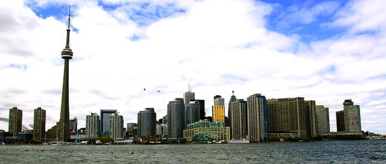
Where Toronto ranked: Fourth
Should Toronto be happy with its ranking: Yes, but are we really the fourth best city in the world? Who cares — we’ll take it.
Score: 67. Expected more. Perhaps their title led us all into a false sense of security with their “Intelligence Unit” label. They gained ticks for their range in criterion — 30- indicators. If you are going to put a city to the sword, at least be fair and having that many indicators does that. They lost points for producing two surveys per year — overkill. And their score methodology was confusing to understand.
Top Ranked City: San Francisco, CA, USA
What’s good: Unlike most livable city surveys, these guys are not chest thumpers. Their mandate is a Walt Whitman (19th Century editor for the Brooklyn Eagle) quote, “ Be curious, not judgmental”. Looking at the ranking too, major cities we know and love like New York, London, Paris all get nods for being top cities because of parameters such as innovation, technology and transit. Along with their report, which is available to browse online, they also include a document breakdown with the main points. One last point: it cost nothing to access.
What’s bad: Is there such thing as being too thorough? Probably not, but, there is a lot of information — good information — and data to make sense of that perhaps be better served in a book, not a web PDF file. And some of the PDF content was in Russian, which makes it really hard (especially if you don’t understand Russian) to scroll through the survey.
What we’d like to see (more of): They need to find a way to make it easier to digest for readers. Seems like they are on a good thing here with the information they supply and how they explain their survey. Wouldn’t alter too many things, but book-form would make it much more user-friendly.
Accessibility: Excellent. The entire report was viewable online. And it was free.
Where Toronto ranked: 2nd (overall)
Should Toronto be happy with its ranking: Yes. It was being measured on important criterion such as health, safety and security, economic clout, ease of doing business, lifestyle assets and technology readiness and came through with flying colours.
Score: 60. It’s only there fourth survey and the 2011 report was the first time they conducted a world city ranking. This could be an emerging livable city survey powerhouse in years to come. They scored well for accessibility and transparency, zero cost and interesting criterion to chew on.
Melbourne, Australia: The beach culture In Melbourne is a main draw for people looking to settle in Australia and adds to their quality of life.Innovation Cities Top 100 rankings
Top Ranked City: Boston, MA, USA
What’s good: They took the bold step of including an “emerging cities list” with more than 30 cities, which none of the big three livable surveys did. The Monocle did a top five cities to look out for, but some of them were places we’ve never heard of. Innovation Cities had believable up and coming cities such as Dubai and Cape Town. They also included a global ranking and a continent ranking and measured their livability across 162 indicators.
What’s bad: The cost to look at the report is $500, which is a bit steep. There are cheaper models out there that produce the same type of survey quality. Also, while having 162 indicators makes it sound like a thorough job, surely there are some indicators in there that shouldn’t be. One of them was geography — sounds a bit vague.
What we’d like to see (more of): Perhaps we could see their 162 indicators to find out what they measured and what type of analysis they conducted. It’s the largest indicator set out of all of the surveys on this list — let’s see it.
Accessibility: Online. It’s clean, short and easy to navigate.
Where Toronto ranked: 10th (Global) 4th (Americas)
Should Toronto be happy with its ranking: Yes. And the ranking seems fair — fourth and tenth.
Score: 41. There’s a lot to like here. They scored well for creating an emerging list section and two different ranking lists. The biggest score killer was its steep asking price of the report. Compare its $500 fee to that of the $15 Monocle price tag.
The Knight Frank Global Cities Survey
Top Ranked City: New York City, NY, USA
What’s good: Another survey that included an emerging market list, which is refreshing. We live in the now, but it’s also good to know what cities will be livable in 10 years time and which to avoid when it comes to quality of living, transit and crime. They have an overall rank, but also included six other ranking lists such as economic activity, knowledge and influence, political power, quality of life and the world’s leading cities in ten years time. Too many? I say it’s innovative to see where your city ranks under different criterion. An overall ranking can be too ambiguous.
What’s bad: It’s too brief and lacks in depth explanation. Also, you have to put in a request to order the full report with no signs of a price tag either.
What we’d like to see (more of): The Knight Frank survey targeted politics and economics and was heavy on power, in doing so, it avoided important criterion such as infrastructure, crime and safety, health. For them to score higher they need more balance in their survey and a lot more explanation about their criteria.
Accessibility: Online. The ranking lists are free to look at, but the report has to be requested which takes time and money.
Where Toronto ranked: 9th (overall), 17th (economic activity), 20th (political power), 3rd (quality of life), 11th (knowledge and influence).
Should Toronto be happy with its ranking: Yes. While ranking 17th and 20th in economic activity and political power respectively, it’s hard not to feel slightly chuffed with the quality of life ranking of third.
Score 38. Scored high for the emerging market list. Why? It included scores for each city and a percentage change since the previous surveys, which is unlike the rest of the livable city indexes. It received a tick for giving us access to not one, but six ranking tables, which gave us an idea on the strengths and weaknesses of cities that polled well. Biggest let down was not having access to the report. If you can’t show us upfront what your research entailed, then you don’t deserve to poll well.
Mercer’s Quality of Living Survey
Top Ranked City: Vienna, Austria
What’s good: It has a brief livable summary for each continent (i.e. what makes it so livable and why) and highlights the top ranked cities and also includes the top 50 quality of living cities. The brief blurb gives you an idea of what cities polled well, which ones didn’t without pouring through pages and pages of data. It also gets a tick for producing one survey annually, as opposed to two or three per year.
What’s bad: We don’t really know how Mercer arrived at the quality of living list. They don’t list the actual report and “accepts no responsibility or liability for the validity or accuracy of the resources and data used to compile the report”. Without transparency, it’s hard to have faith in their list and it makes it less credible.
What we’d like to see (more of): The actual report. You can’t even purchase it.
Accessibility: The city ranking lists are online; the report could be sitting in someone’s desk draw in Vienna for all we know.
Where Toronto ranked: 15th
Should Toronto be happy with its ranking: The worst part about Mercer’s secrecy is that Toronto’s rank of 15 sound about right. But, we’ll never be able to read about why they were on the money.
Score: 30. Quite simply it was too light on for information on things like how thy arrived at their ranking list. Scored points for its two different lists — how they presented it — and the fact it comes out once a year, but failed miserably for not being more obvious about their survey information. As a big player in the world of livable surveys, this is a major let down.
Housing: Some of the elements that make up quality of living, like rent and housing, are often ignored by livable city surveys.So, what to make of all this you ask?
The livable city surveys act as a guide and it’s very hard to take what they produce as gospel seeing as most of the writers have never been to the cities they are analyzing. Pouring over data and declaring who makes the cut in livable cities is all subjective and we need to take note that, most of these surveys carry some sort of slant based on their publication or organization. It’s easy to get carried away with a good ranking, we’re all guilty of bragging to one another when your city gets the nod for a top ten position, but when it’s all based on one aspect of what makes a city livable, such as economics or strictly culture as examples, you have to keep that in mind. Who’s the big winner? No-one received perfect marks in our critique. Each survey had an element they were missing that if included, would make it useful for readers to grasp what makes a city livable and what areas (i.e. aspects of living) they need to improve on compared to other cities.
____
Justin Robertson is a freelance journalist from Toronto. His work has appeared in The Walrus, National Post and Toronto Standard. Follow Justin on Twitter @justinjourno
For more, follow us on Twitter at @TorontoStandard and subscribe to our newsletter.


